Mrs. Meyers Clean Day: Garden Goodness Surprise
in-store displays & marketing materials, print ads, social media, retailer ads
ROLES: Concept Development, Art Direction, Photoshoot Art Direction, Graphic Design/Illustration
COPYWRITER: Erin Heraty / REGION: United States, Europe, Japan
The Problem:
Mrs. Meyers Clean Day encountered significant hurdles in expanding its customer base, primarily due to prevailing perceptions that the brand's emphasis on garden-inspired fragrances and its commitment to avoiding harsh chemicals resulted in products that were less effective for cleaning tasks. This misconception created a barrier to attracting consumers who were otherwise aligned with the brand’s values but skeptical of its efficacy.
The Insight:
Insights gathered from consumer behavior studies within large grocery store environments—where Mrs. Meyers' products are predominantly sold—revealed an interesting trend. A substantial segment of these shoppers demonstrated an interest in making environmentally conscious decisions, even in small ways, such as choosing cleaning products that are less harmful to the environment. This demographic represented a ripe opportunity for Mrs. Meyers, provided the brand could effectively communicate the efficacy of its products alongside their environmental benefits.
The Creative Solution:
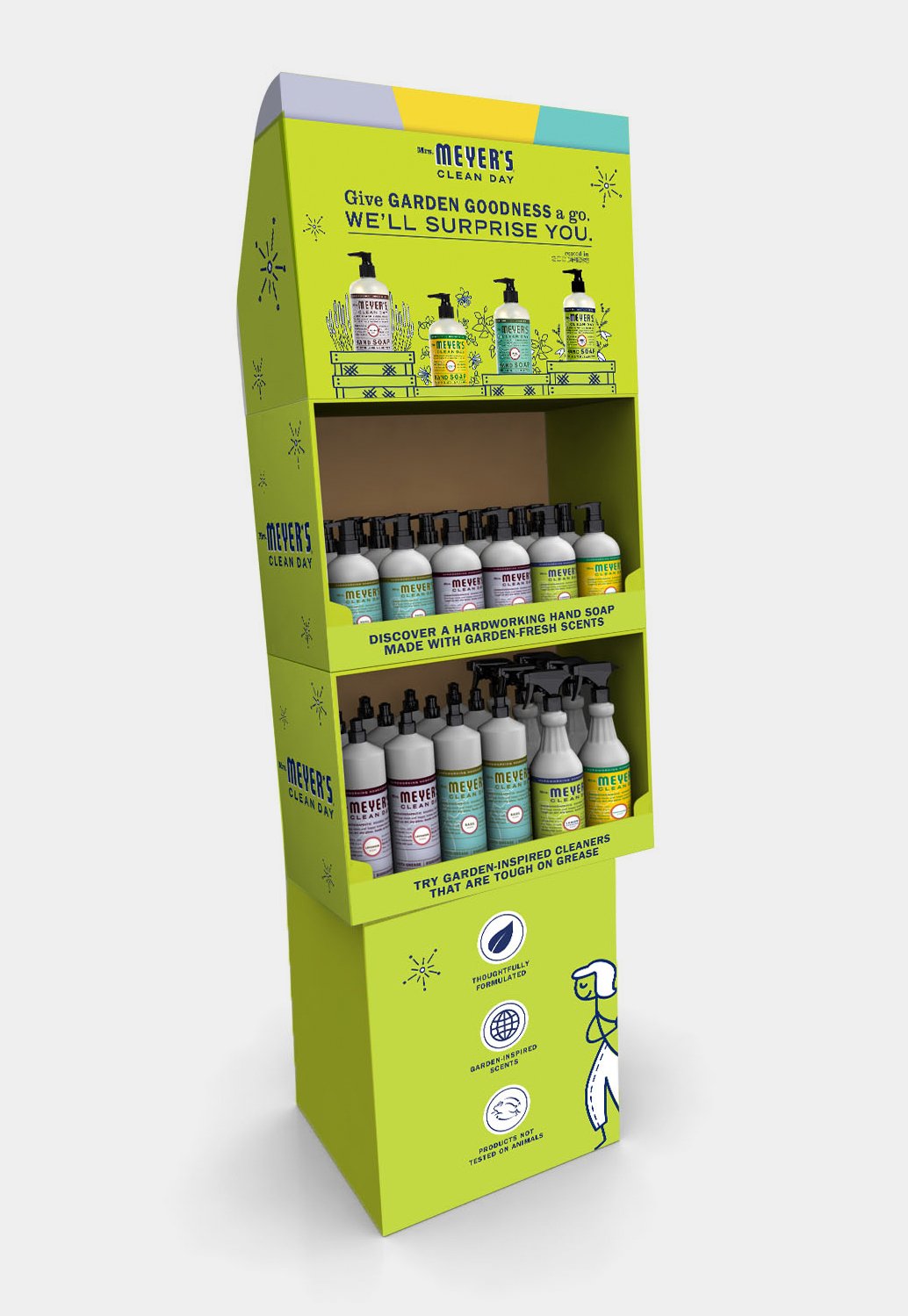
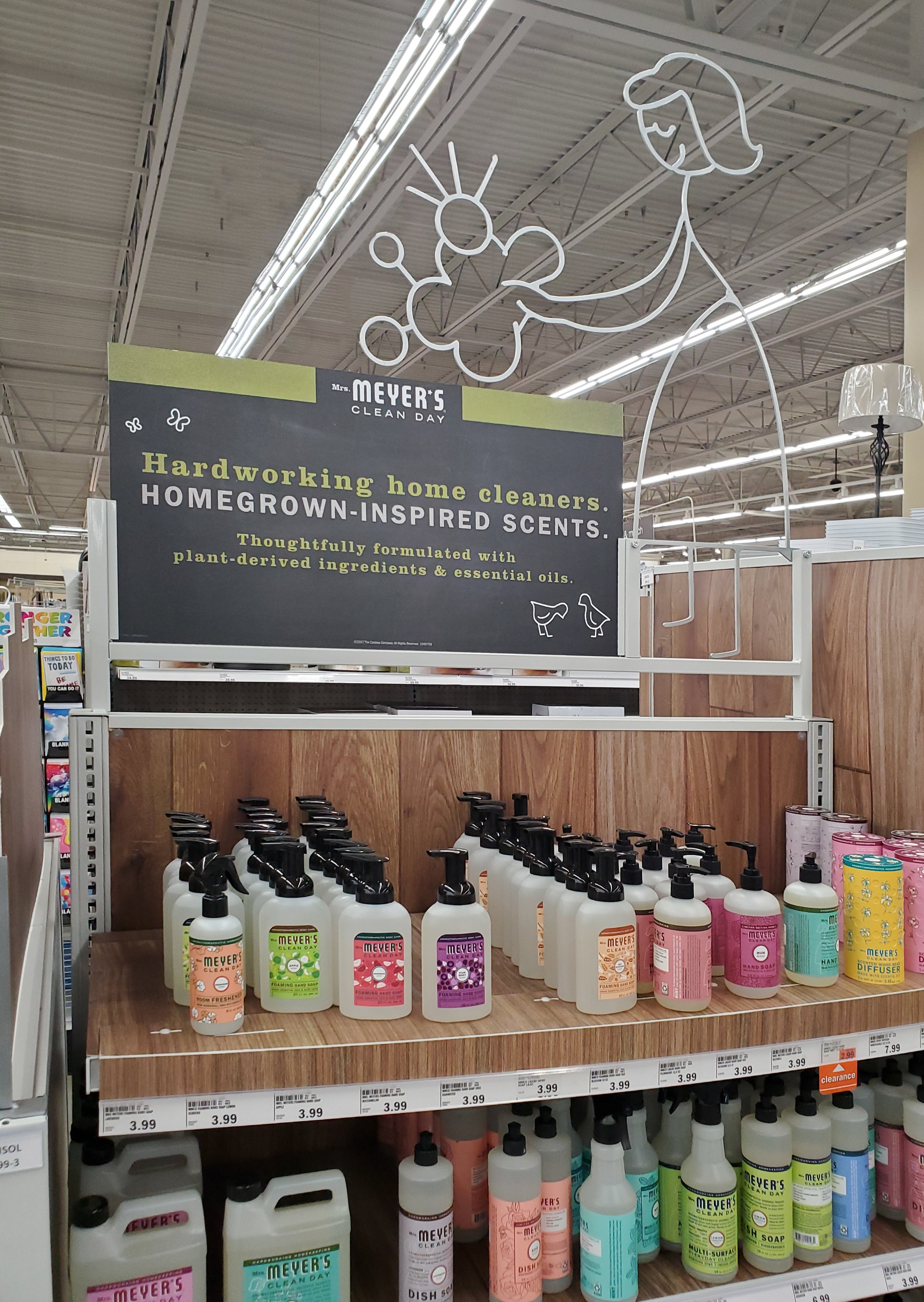
To shift consumer perceptions and tap into the environmentally conscious shopper segment, we implemented a "surprise and delight" marketing strategy. This approach was designed to challenge and overturn the negative assumptions about the brand by presenting its products in a new light. The campaign introduced whimsical new characters in advertising materials, embodying the element of surprise with their dynamic entries—swinging, peeking, and popping into view, often amidst bursts of confetti or fireworks. These characters, alongside vivid illustrations of fireworks and product displays set against planter boxes filled with corresponding scent elements, aimed to visually communicate the delightful garden-goodness surprises that Mrs. Meyers' products offer. This creative direction not only sought to address misconceptions about effectiveness but also to resonate with the target audience’s desire for environmentally friendly choices.
The Execution:
The campaign was rolled out across the U.S. and later in Europe, with a focus on France for the brand's European launch. Efforts included special in-store displays featuring LED fireworks and basil plant giveaways, scent sampling opportunities, and unique counter displays for impulse purchases at checkout areas. Print ads ran in USA Today's Green Living publication, and character-driven art was featured on massive banners and posters in Paris, as well as in extensive aisle takeovers in major French retail stores. Custom endcap displays were designed for Meijer stores in the U.S., maintaining the brand's distinctive chalkboard aesthetic and garden theme.
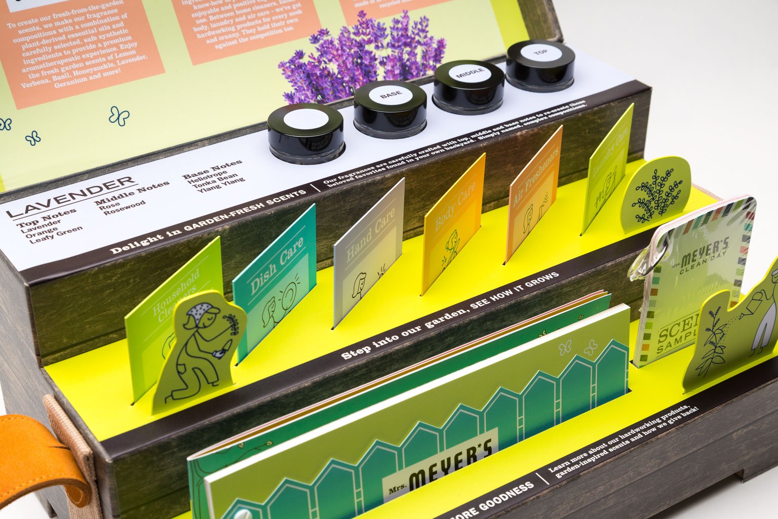
A standout component of the execution was the development of a unique presentation kit designed to captivate retailers. Inspired by a planter box discovered during a trip I made to Ikea, the kit was conceptualized and brought to life through collaboration with a 3D designer and printer. The final product—a box shaped like a wooden planter box, complete with embossed textures to mimic real wood and a guitar strap handle for ease of transport—served as an immersive introduction to Mrs. Meyers' brand ethos. The box's interior was carefully arranged to present the brand's core messages and product line, featuring tiered levels of scent samples, vibrant information cards styled after seed packets, and a detailed booklet with a charming die-cut picket fence cover. This presentation kit, combined with the broader campaign efforts, underscored Mrs. Meyers' commitment to delighting consumers and retailers alike with its effective, environmentally friendly cleaning solutions.