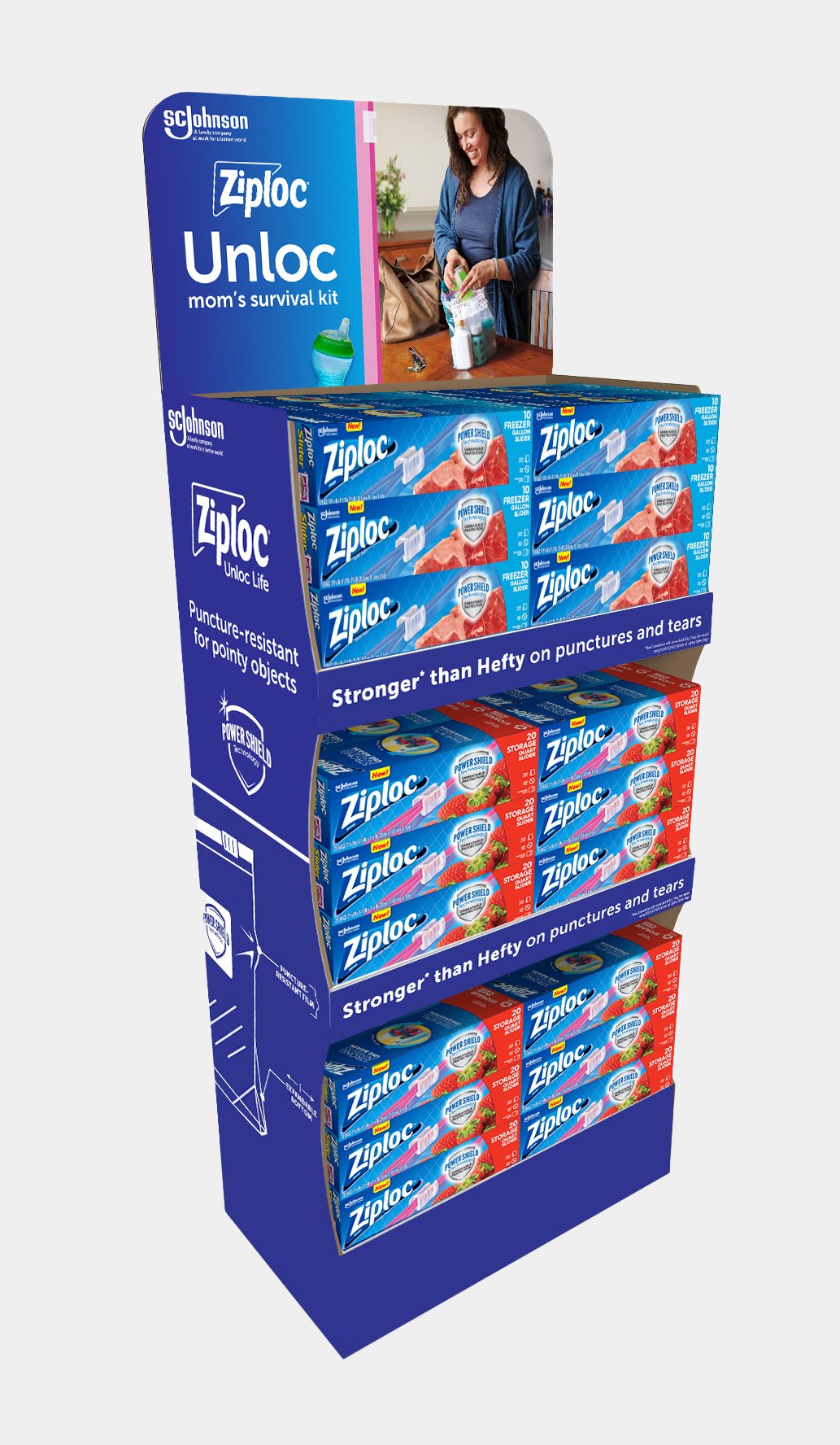
Ziploc Unloc Life: Brand Restage
ROLES: Concept Development, Art Direction, Photoshoot Art Direction, Graphic Design
COPYWRITER: Blair Pische / ART DIRECTOR: Evy Luong / REGION: United States, Canada, Australia, Argentina
PHOTOGRAPHER: Product - Greg Shapps, Lifestyle - Kevin Arnold, Cassandra Plavoukos
The Problem:
Ziploc was facing a significant challenge in the marketplace as it consistently lost sales to more affordable generic and store-brand plastic bags. This trend underscored a pressing need for the brand to articulate its value proposition more effectively to consumers who were gravitating towards lower-priced alternatives without considering the qualitative differences.
The Insight:
A pivotal realization came from acknowledging the extensive efforts of Ziploc’s dedicated research and development team, which ensured that each Ziploc product stood out in terms of quality and innovation. This insight formed the basis of a strategic approach to reposition Ziploc not just as a mere storage solution but as a premium brand that offered something unique. It became imperative to communicate these advantages—highlighting the superior technology and design behind Ziploc’s tabs, sliders, film, and containers—as a compelling differentiator to sway consumer preferences.
The Creative Solution:
The strategy led to a holistic revamp of the Ziploc brand identity, with an emphasis on celebrating the role of Ziploc products in facilitating life's memorable moments. The initiative aimed to shift the narrative from focusing solely on the functional aspect of storage to the emotional and practical benefits of using Ziploc products to "unloc" life's joys and conveniences. This reimagining involved showcasing how Ziploc enables experiences such as sharing meals, preserving memories, and organizing daily essentials in a more engaging, relatable manner.
The Execution:
Collaborating closely with BBDO Chicago, the campaign revitalized Ziploc's visual identity to align with the "Unloc Life" theme. This included the adoption of a refreshed color palette dominated by blue hues synonymous with the Ziploc brand, complemented by specific colors tied to their signature product features. Additionally, new graphic elements were introduced to visually represent the unique attributes of Ziploc’s products across all marketing materials, emphasizing lifestyle applications that resonated with consumers.
The campaign creatively positioned Ziploc products as enablers of various life experiences—from making first-day school friendships with shared sandwiches to extending the freshness of desserts in the fridge. To underscore the innovation behind Ziploc's offerings, the campaign featured sophisticated macro visuals reminiscent of high-tech product launches, highlighting the meticulous design of zippers, easy-open tabs, and leakproof lids.
To bring this vision to life, remote photoshoots were orchestrated during the initial lockdown period in 2020, involving lifestyle photographers Kevin Arnold and Cassandra Plavoukos who captured authentic "Unloc-ing" moments with their friends and family. Product photographer Greg Shapps shot detailed macro images of 18 distinct Ziploc products, showcasing their innovative features in a visually striking manner.
The comprehensive rebranding and global campaign have successfully established a new visual standard for Ziploc, prominently featured across online and brick-and-mortar retailers worldwide, including major chains like Meijer, Sam's Club, Costco, Walmart, Jewel-Osco, Amazon, Lowe's, Target, and Publix, as well as local stores across the U.S., Europe, Australia, and Japan. This strategic overhaul has not only differentiated Ziploc in a crowded market but also reinvigorated consumer interest and engagement with the brand.